Thanks to the Chartstravaganza by @PlanMaestro and Germany’s Christian Drosten who directs the Institute of Virology at the Charité Hospital in Berlin for providing this background information.
Infectious disease is confusing. When Goldratt wrote The Goal, the hero Alex Rogo never wanted for good data. C19 has presented confusing, conflicting data around the goal. This calls into question measurement and observation methods. It makes decisions harder to make.
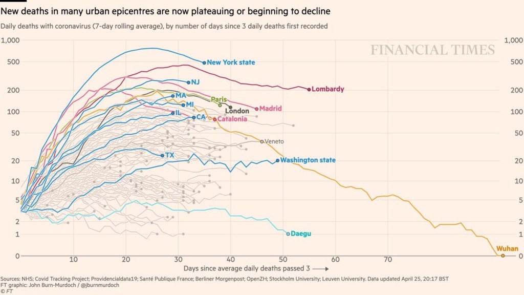
For all of the confusion that comes from the original data, we see an added layer of confusion in how this data is reported and interpreted. There are clear cases where the way in which the data is presented is driving towards a specific answer.
Case Rates
China’s case growth looks artificially flat. Presenting fatality or case rates which have not been normalized by population size seems like deliberate manipulation of data.


Sweden – Good or Bad?
Sweden followed a different plan on social distancing. The graph on the left is presented to make Sweden look bad – more fatalities. The graph on the right is presented to make Sweden look good by choosing a peer group with less fatalities. The graphs below are based on the same information and presented by the same organization.


Pingback: All Cause Mortality Data Shows C19 Impact, Right? | Fred Lybrand